
Heat, football, flying, and a few uncomfortable data truths
Here are the top ten data charts from June 2026, decoding the future of the travel and mobility industries.

Hey chart friends,
Today’s OneChart is a bit of a wild chart ride through Europe’s heat wave, World Cup ticket madness, and the eternal reminder that airlines are great to fly with but brutal to invest in.
Let’s get into it.
Chart #1: Europe has become too hot for its no-AC culture
Wow. After a week of close to 40°C temperatures across Central Europe, it has finally dropped below 25°C again (at least here in southern Germany).
And as much as we Europeans don’t like to admit it, this past week was a reminder that Americans may have been right about one thing all along: Air conditioning.
Which brings me to today’s first chart.
It has been going viral on social media with a pretty brutal headline:
More Europeans die of summer heat than Americans die of guns.
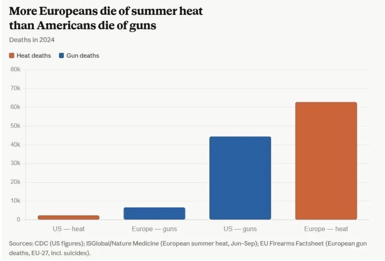
Now, if you know me, you know my first reaction to a viral chart like this is usually not “wow.”
It’s more: Wait, is this chart actually clean? Especially in this case, because my European pride was slightly offended.
My assumption: We cannot be that bad at protecting ourselves from heat, right?
So I looked into the underlying data and quickly found a few inconsistencies across different definitions and counting methods for heat-related deaths.
For a second, I thought about rebuilding the chart myself, but it would have taken a lot of time.
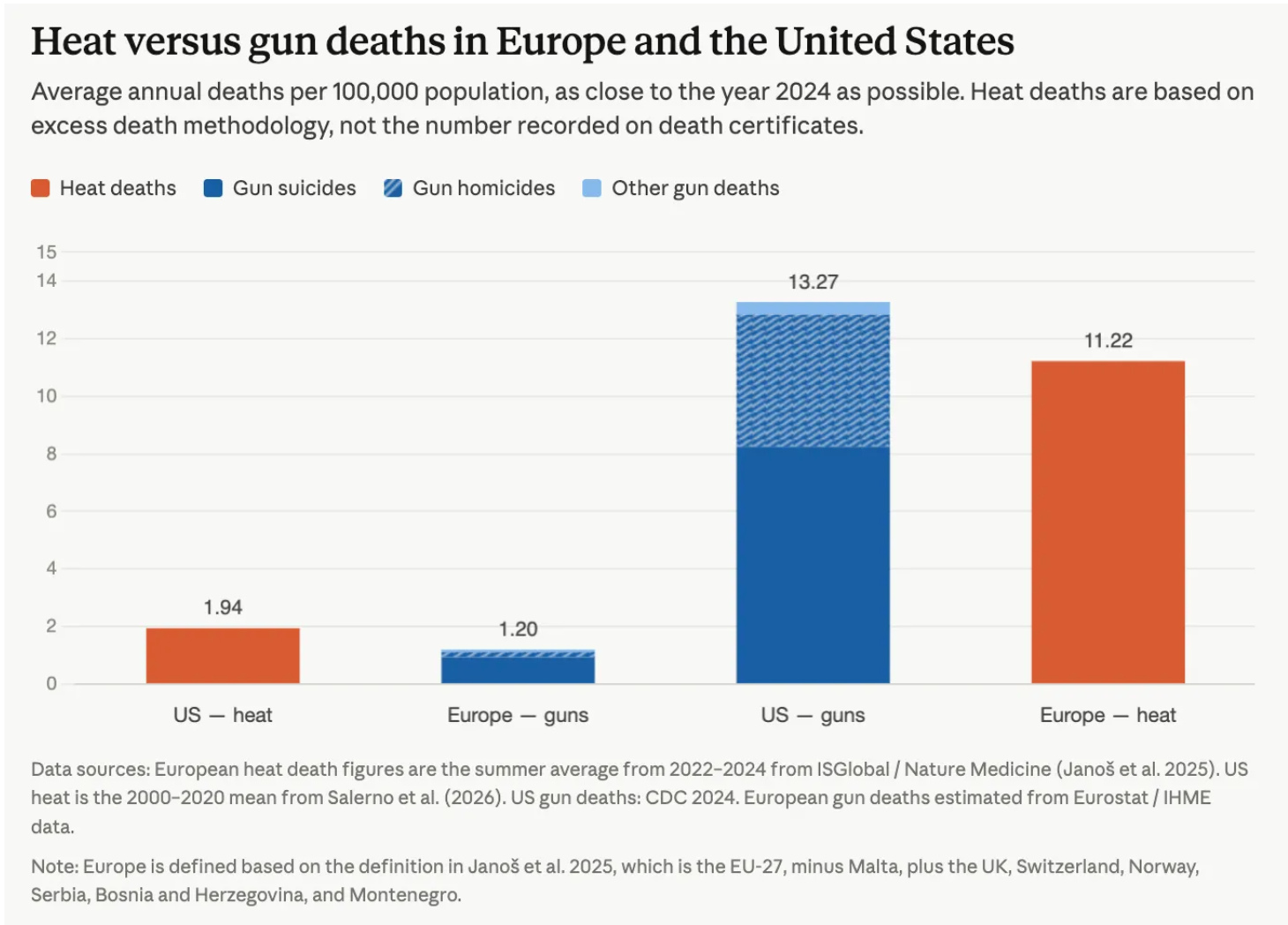
Luckily, I found Hannah Ritchie, who did the proper work and rebuilt the chart with cleaner assumptions.
- She found that the original viral chart used inconsistent heat-death methodologies and mismatched definitions of “Europe.”
- But, and this is the important part, the overall conclusion does not change much in absolute terms.
- On a per-capita basis, the comparison shifts slightly because U.S. gun deaths are slightly higher than European heat-death rates.
But the uncomfortable point remains:
Here’s what I think about this:
I don’t see this as a “which region fails more badly?” competition.
It’s about status quo bias:
- The U.S. has normalized gun deaths.
- Europe has normalized heat deaths.
Both are rich-world failures that people somehow treat as inevitable.
Funny thing: I discussed this comparison with friends at a BBQ at our place over the weekend (while we were basically rubbing ice cubes on our necks like this was a legitimate cooling strategy).
And the immediate reaction was:
“Yes, but air conditioning is really bad for the environment.”
Which is not wrong.
But it also kind of proves the point.
In Europe, our climate instinct often jumps straight to energy guilt before public-health protection.
Of course, blasting inefficient AC everywhere is not the answer.
But neither is pretending that stone walls, open windows, and a very confident attitude toward shade will solve 40°C summers.
Europe’s lack of cooling infrastructure is already costing thousands of lives each year.
And if summers keep getting hotter, this won’t just be a public-health issue. It will also affect how attractive Europe feels as a summer destination.
Just saying…
Chart #2: Too many surveys, too little insight
There are far too many shaky survey reports floating around these days. That applies just as much to media outlets as to companies trying to build their own research and insights functions around superficial questionnaires.
I recently called out one example from an Expedia report, where a questionable finding quickly spread across the wider travel-tech ecosystem.
That doesn’t mean all surveys are useless, of course.
But the explosion of AI-assisted research slop certainly isn’t raising the bar for quality.
I’ve therefore long been a fan of alternative ways to measure changing sentiment and behavior.
- For example, together with Lufthansa Innovation Hub’s TNMT team, we analyzed four years of earnings-call transcripts from the world’s ten largest airline groups.
- Instead of asking executives what their priorities are, we tracked what they actually chose to discuss with investors and how those priorities shifted over time.
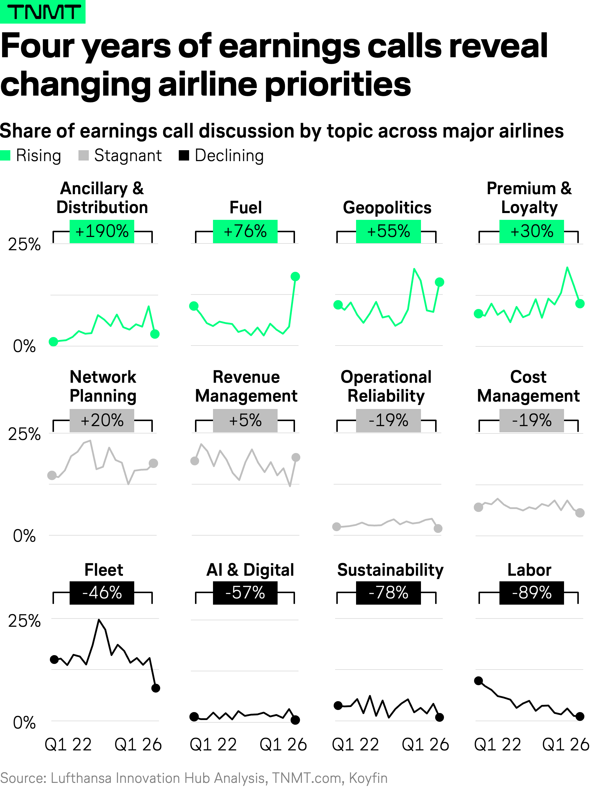
To be fully transparent, earnings calls aren’t bias-free either. But they’re grounded in real business pressure, not hypothetical multiple-choice answers.
Sometimes, listening beats asking. Here is the full analysis in case you’re interested.
Chart #3: Geopolitics is eating the executive agenda
Speaking of earnings calls, we’re not the only ones mining the unstructured signals hidden inside them.
Boutique consultancy IoT Analytics has long published quarterly analyses across industries.
Its Q1 2026 findings look surprisingly similar to our airline-specific view: More geopolitics and less sustainability.
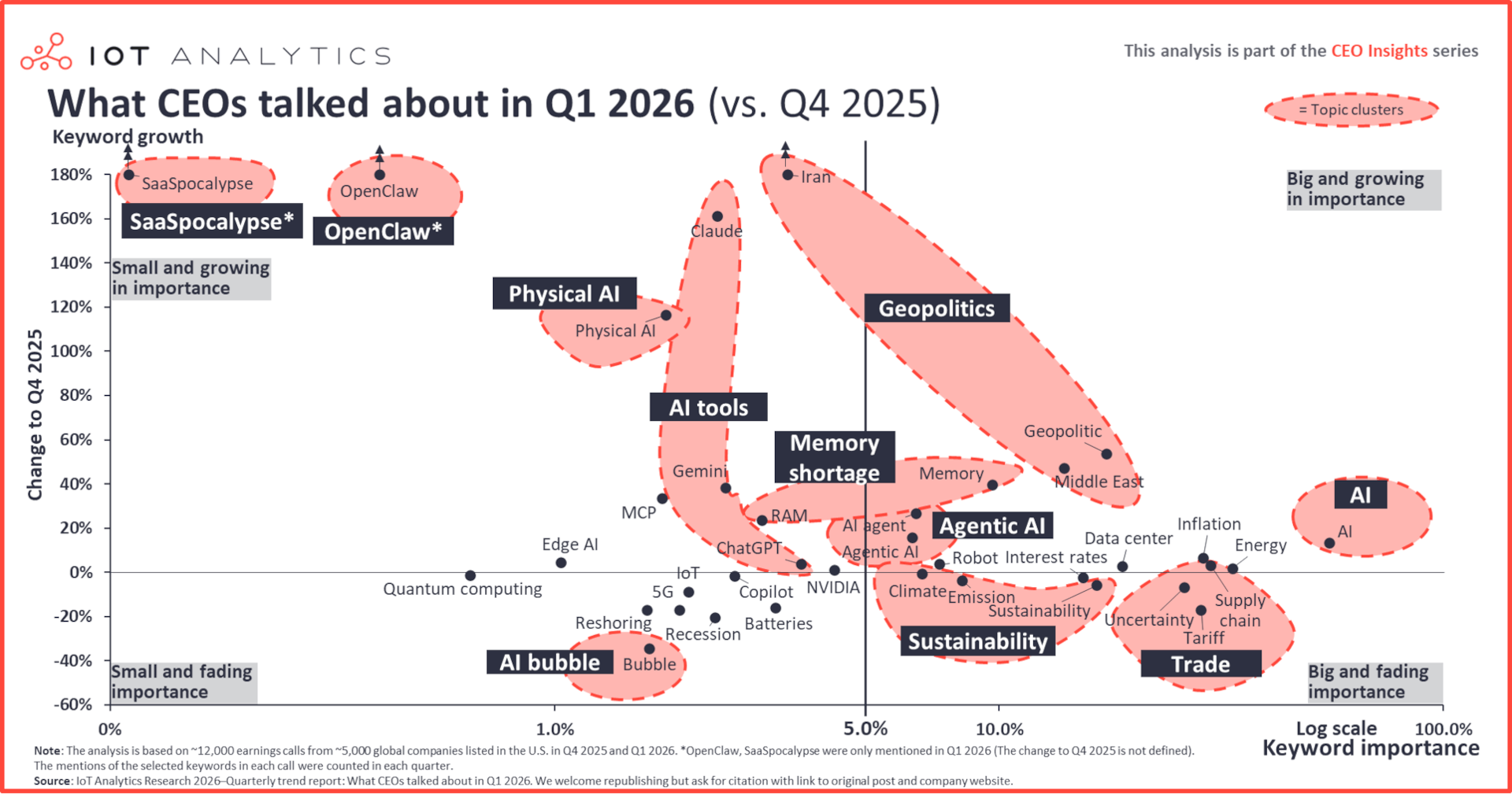
Chart #4: Automation panic is older than AI
Speaking of unconventional, non-survey ways to read the zeitgeist.
Benedict Evans (one of my all-time favorite analysts) used Google Books’ Ngram Viewer, which tracks how frequently words and phrases appear across millions of digitized English-language books over time.
He searched for one word: “automation.”
Here’s what that looks like in chart form:
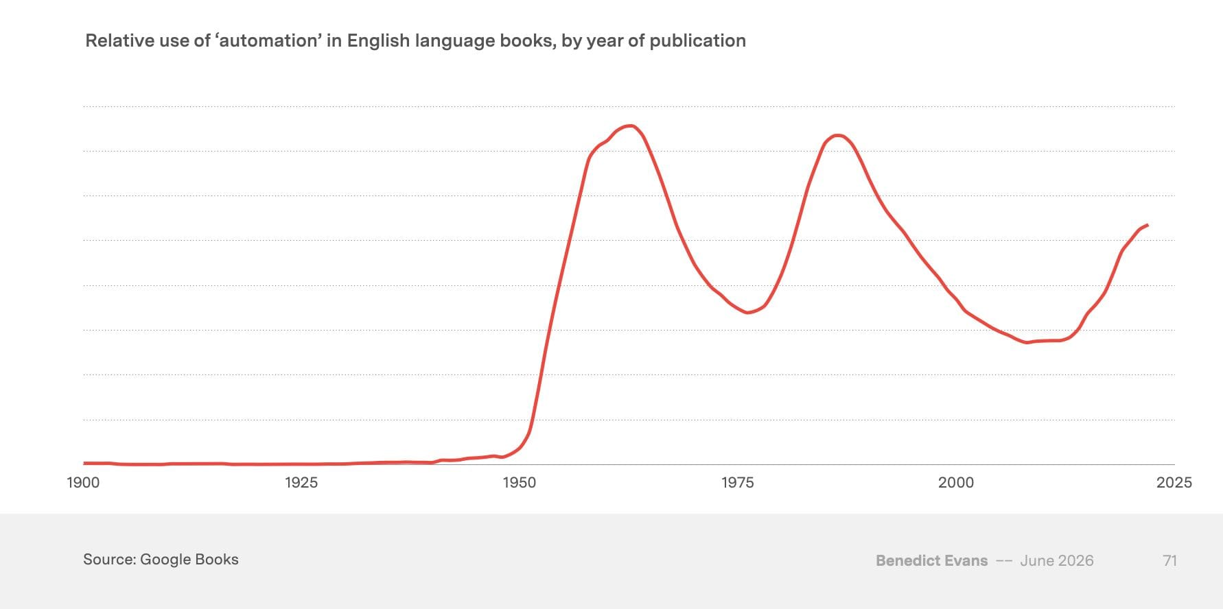
The wave pattern over the past 75 years is pretty striking, isn’t it?!
Apparently, every generation becomes convinced that automation has finally arrived to transform work forever.
My takeaway: AI may be new. Automation panic is vintage.
Chart #5: The new dream employers
Speaking of AI, I still remember graduating from university roughly 15 years ago and studying rankings of the world’s most desirable employers to figure out where to apply.
Back then, prestige meant Google, Facebook, or one of the big management consultancies, depending on whether you preferred coding or PowerPoint (I clearly fell into the latter camp).
But times have changed.
In today’s automation era 3.0, AI is the new sexy.
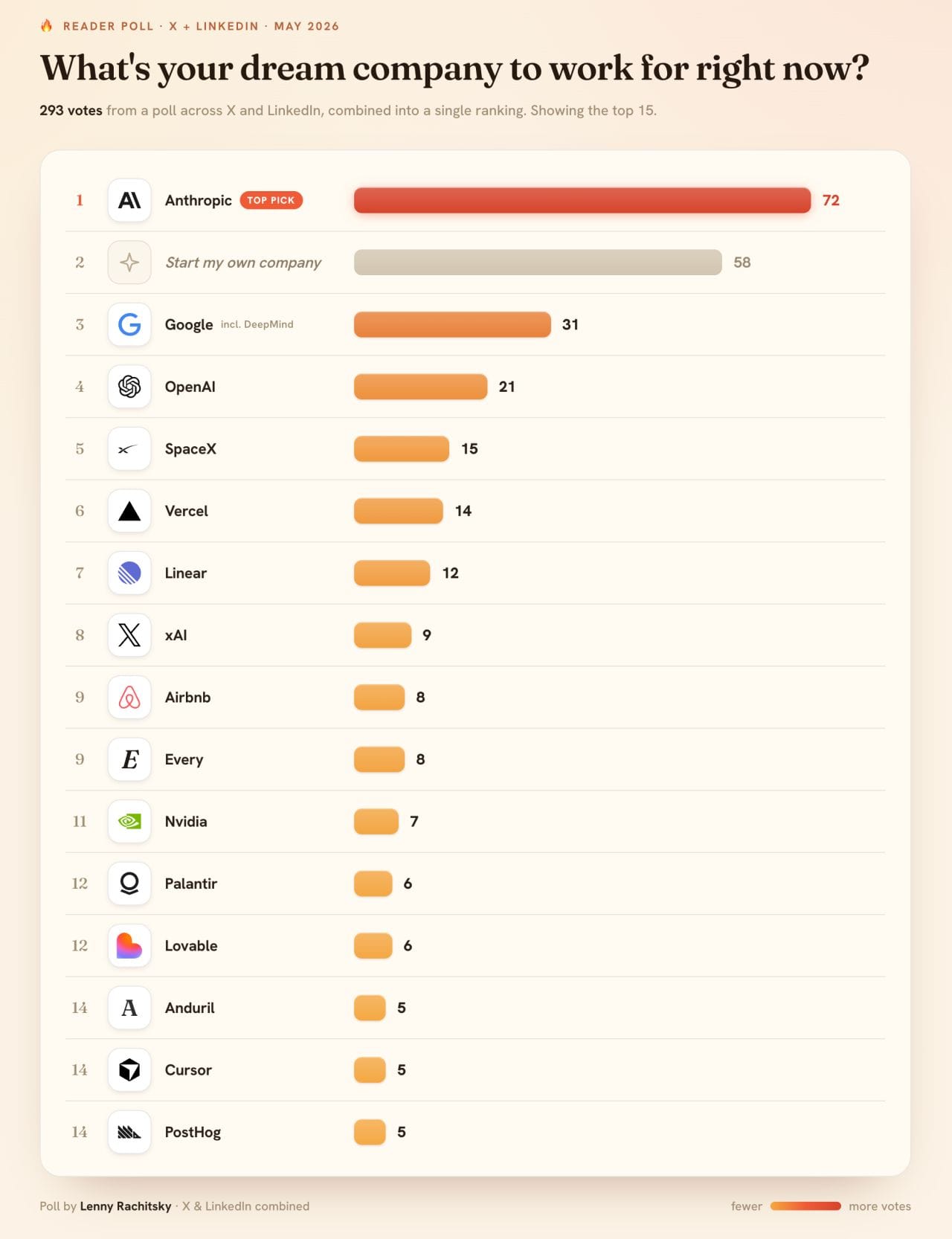
Important caveat: Lenny’s audience likely skews heavily toward product and tech professionals, so this is hardly a representative workforce survey.
Chart #6: Even the World Cup books last minute
Let’s switch gears and zoom in on travel.
Also, finally, a chart that allows me to classify my football obsession as professional research.
- The FIFA World Cup is clearly the biggest sporting event driving travel demand this year.
- Yet for hotels, airlines, and other travel providers, planning for it has been anything but straightforward.
In Los Angeles, for example, nearly 30% of all hotel room nights sold for the opening match were booked during the final week before kickoff.
Source: Airdna via Jamie Lane
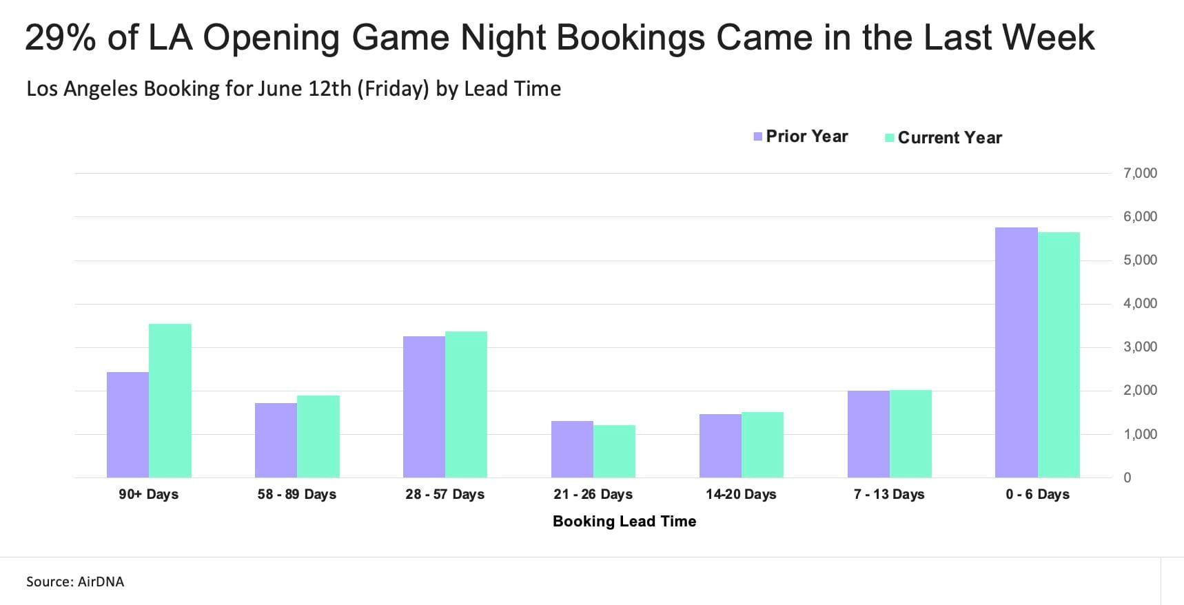
That creates a brutal pricing dilemma: hold rates too high for too long and risk empty rooms or discount too early and leave money on the table…
Chart #7: The beautiful game gets an ugly price tag
Sticking with football and the World Cup for one more chart.
- When the U.S. last hosted a World Cup in 1994, the best tickets for the final cost $475, or roughly $1,040 in today’s money.
- At Qatar 2022, the top price was around $1,750.
- This year, FIFA first pushed top final tickets to almost $10,000
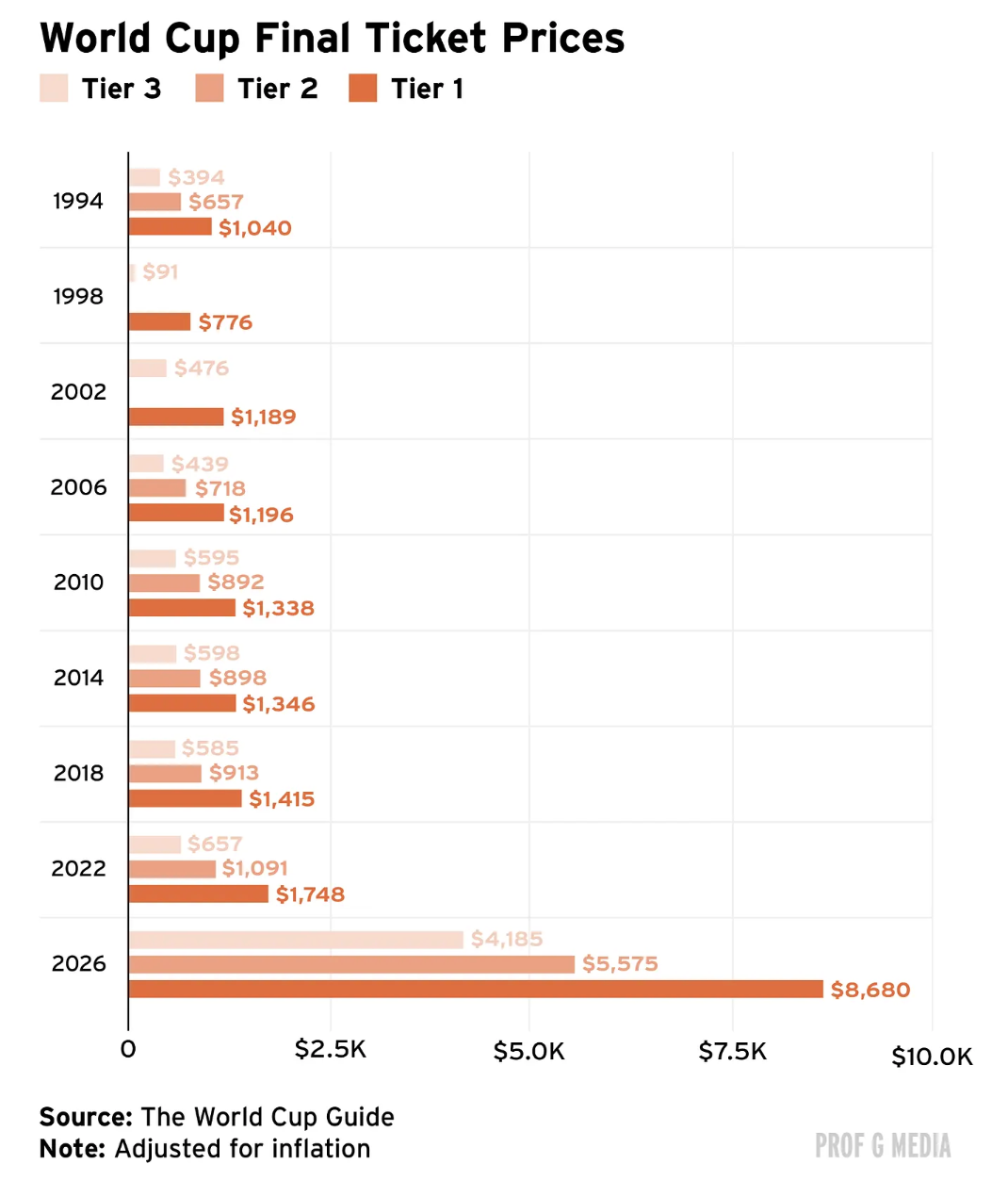
Chart 8 + 9: Airfares are not the price villain
Speaking of price increases.
Remember February?
A geopolitical shock in the Middle East sent jet fuel prices sharply higher (from around $2.30 per gallon to $4.88 per gallon).
Airlines warned that fares would rise as a result.
So what happened? Fares did rise.
- In the U.S., domestic airfares are up roughly 20% since the beginning of the year.
- International flights departing from within the U.S. cost about 8% more.
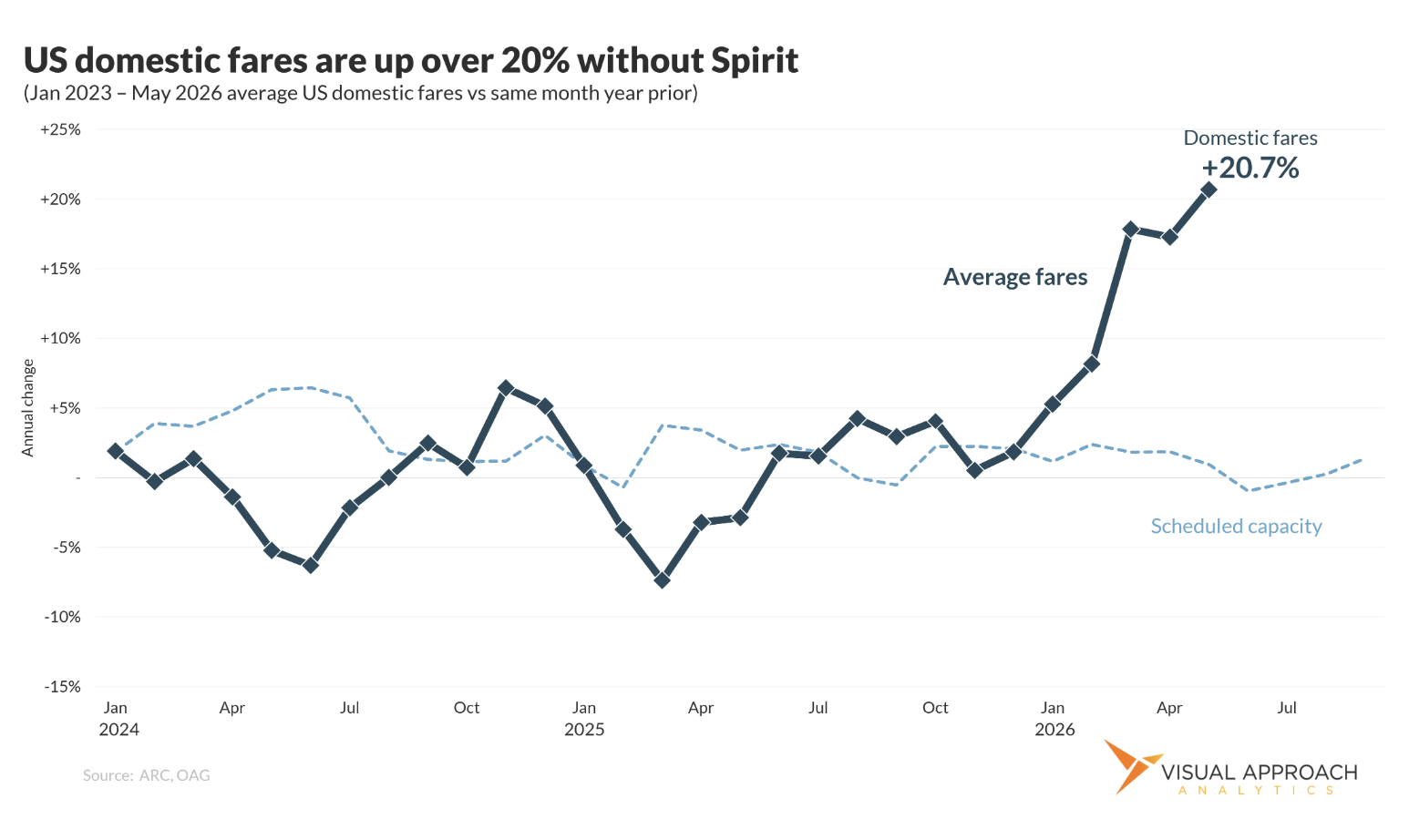
At first glance, that sounds like a very convenient airline excuse.
Fuel is up, fares go up. Simple story.
Except, as Courtney Miller explains in this excellent breakdown, the reality is more nuanced.
Since fuel typically accounts for roughly 20% of airline operating costs, that translates into something closer to a 5% increase in overall costs.
So a 20% fare increase looks… ambitious.
But fuel is not the only moving part.
- Airport charges have risen.
- Ancillary fees have gone up.
- And most importantly, capacity has tightened.
And when supply gets constrained, pricing gets messy very quickly.
So yes, fares are up.
But no, this is not just a clean “fuel prices doubled, therefore tickets doubled” story.
Now, before we blame airlines for ruining summer vacation entirely, let’s zoom out.
This second chart below is one I keep pulling up whenever I see headlines about air ticket prices “soaring to new heights.”
Because yes, many travel-related experiences (including World Cup games) have become painfully expensive.
But airline tickets?
Surprisingly boring.
That’s a useful reminder before we blame airlines for every expensive trip this summer.
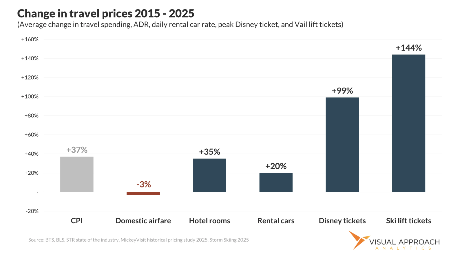
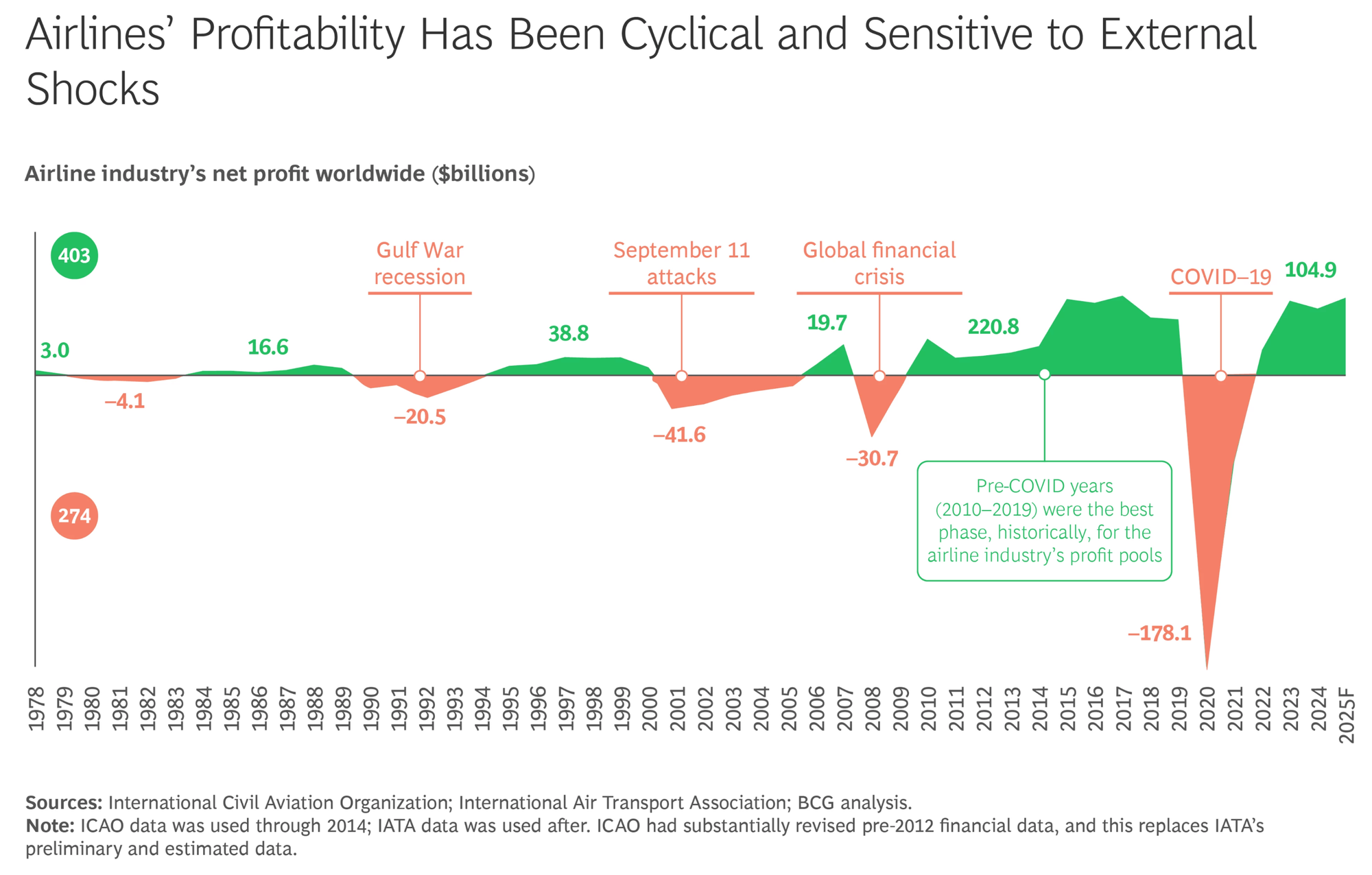
Chart #10: Great for travelers, brutal for shareholders
Speaking of evergreen airline charts worth revisiting.
This last chart for today explains why low airline ticket prices are great for travelers, but not necessarily great for airlines themselves.
Why?
Because airlines are exposed to almost every imaginable external shock.
Not investment advice, obviously. But that 50-year chart is doing a lot of advising on its own.
That’s it for today.
We’ll speak again next month.
Until then, feel free to share this with a friend or colleague who gets unreasonably excited about a good data chart.